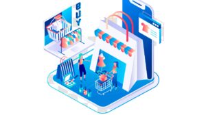
Whenever we talk about eCommerce stores, it is not about big logos and shiny products and their images. However, it is all about giving shoppers the information, direction, experience, and a ‘BUY NOW’ button by providing a seamless shopping experience to customers.
Creating an effective landing page for eCommerce is pivotal to growing your business. In this article, we consider five effective hacks to grow sales by optimizing eCommerce landing pages.
So, here are some proven hacks that can make the upcoming year the best-selling year yet.
1. Eradicate Site Navigation
A good eCommerce website is reflected in its navigation. It is difficult for eCommerce marketers to stick to their online stores and focus on CTAs. There are some distractions on your online store’s homepage, such as product category pages and other links or buttons that could distract visitors from offers and other purchase decisions. Simply put, an easy and attractive landing page design with no site navigation can help to fulfill the objective.
If users find the desired information as what they are looking for in terms of the CTA button, which consists of no additional offers and links, it is easier for them to get what they want. This way, you need to remove other navigation links, categories, drop-down boxes, side menus, etc. By adopting this practice, your customers can focus on the CTA button.
2. Compelling CTA (Call to Action)
A compelling CTA should be as simple and frictionless as possible. This way, you can easily attract the right audience to your eCommerce website. Use words and phrases that directly encourage buying, signing up, or transferring to the chatbot. Add a clear and persuasive CTA so that visitors can make their decision easier. Also, it will lead visitors into the sales funnel more quickly without any distraction while helping eCommerce marketers achieve their conversion goals.
As per the study, landing pages with one clear CTAs have a higher conversion rate (13.5%) than those with two and four CTAs (11.9%). Moreover, five and more CTAs have an average conversion rate of 10.5%. This is comparatively lower than other landing pages with one and fewer CTAs.
The position of CTAs can make or break the odds of generating leads and conversions. You need to make sure that CTA should be displayed prominently and designed for target customers. Place the CTA button at the top or bottom of the landing page in order to get more prospective customers. The CTA button must be large and straightforward to educate shoppers on what to do next. Don’t forget to use color contrast, bold colors that draw your customers’ attention are an excellent way to attract visitors.
Bottom Line: A personalized CTA actually makes conversion rates 202% better. As per HubSpot study, 330,000 CTAs with three different types i.e., basic, multivariate, and smart CTA, has proven this statement.
3. Don’t Forget to Add Social Proof Notifications
One of the best methods of winning the trust of your customers is by adding social proof notifications. You can showcase these notifications, which display the names of the customers who have recently bought from your eCommerce store.
These notifications can help your store in many ways. First, visitors can start trusting your website and help you to leverage the fear of missing out (FOMO) to market the products. This way, visitors feel that those products are worth purchasing. Plus, they may fear that they may miss out on those products if they do not purchase at that time.
Now, the question is how to add these notifications?
Use tools like TrustPulse, which can seamlessly integrate it into your eCommerce store. Also, you can add social proofs in terms of the following ways:
- Images, ratings & reviews
- Expert reviews
- Customer testimonials
- Influencers & celebrities endorsements
- Real-time stats
- Customer count
- Social share count
- Certifications & trust badges
This will eventually help you to grab more customers and good sales.
4. Optimize for Mobile Devices
The usage of mobile devices has been dramatically increasing, especially since the pandemic is here. According to Google, if online customers have a negative impact while using mobile devices, chances are 62% of online shoppers will not consider your brand in the future. So, make sure every page of your eCommerce store delivers a seamless user experience on various devices. Suppose you are not creating the landing page for mobile devices; you may miss out on a huge sales potential.
Additionally, make sure that the eCommerce landing page for online stores is responsive and offers a great user experience on mobile devices. You can create a perfectly aligned page by adjusting forms, images, videos, and CTAs, which fit correctly on the device.
Optimizing eCommerce landing pages for mobile devices allows users to easily access content, explore offers, and other benefits of using the products. Thus, it will surely provide a great user experience and a great chance of conversions.
5. Design Landing Page Nicely
If you want to convert your visitors into customers, it is essential to design landing pages nicely. It means that you should make it easier for your visitors to give information and nudge them to do so.
Even though you can build trust by adding testimonials, it can help your online store grab your customers. You could also showcase your case studies if it is required for your brand. Also, don’t forget to highlight your unique selling propositions too.
When it comes to the form that your customers are required to fill out, it should be short and to the point. If your registration form is too long, then they may not fill it out and might bounce away.
Undeniably, long-form is a great way for blogs, but a landing page must be concise and highlight CTA.
Wrapping Up
Starting an eCommerce business is troublesome like any other real business. It only becomes successful if it comes with strong planning, a good team and affordableeCommerce website development cost. In the right manner, the best eCommerce landing page can give your store great visibility, attract a larger audience, and skyrocket your sales.
Hence, the above-mentioned hacks can help your business in many ways. Keeping a note with these hacks can help to convert into more shoppers.


