If you’re using social media for your business, you’ll want to maximize your conversion rates. Social media landing pages can help you do this.
But for that to happen, you need to know the right way to create those types of pages in the first place. So, what exactly is the right way to create a social media landing page? Wait, let’s back up a bit. What exactly is a social media landing page?
You’ll learn the answers to those questions in this article.
What is a social media landing page?
A social media landing page is a dedicated page created for a visitor coming to your site from social media. The goal of a social media landing page is to generate a conversion. That conversion might be a sale, getting someone to subscribe to your email list or something else entirely.
The starting point of the funnel could be a social media ad or an organic link from one of your social media channels. Let me give you an example.
The Facebook ad below is for Jarvis, an AI-powered tool that promises to make writing content faster and easier. The goal of the ad is to get people to click through to a sales page:
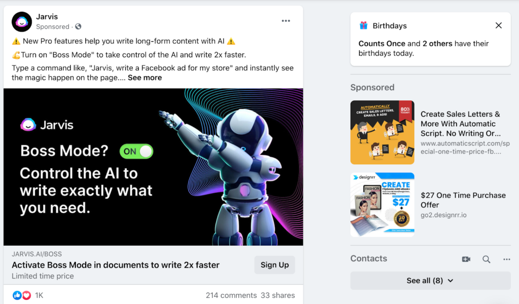
The social media landing page below has been optimized so there is a smooth transition from the ad. The color palette and fonts are the same, the CTA button is visible, and the copy tells you what to expect when you activate “Boss Mode”.
Aside from the CTA, there are no other clickable links on the landing page.
So that’s how a social media landing page works.
How do you build social media landing pages that work then? Before discussing techniques for building effective social media landing pages, let’s see why your business needs them.
Why does your business need a social media landing page?
Social media landing pages are designed to increase the likelihood of generating a conversion. An improved conversion rate will result in more leads or sales and will reduce your marketing costs. Those savings can be significant if you’re running a paid marketing campaign.
Let’s go back to our Jarvis example.
If a person clicked on the Facebook ad and landed on their landing page, they might sign up. However, it’s not an optimal user experience. A person might click on one of the links in the menu. That will reduce your conversion rate.
More importantly, though, the landing page doesn’t deliver on the promise of “Boss Mode.”
Now take a look at the Jarvis social media landing page in the previous section.
There’s only one clickable link on the landing page, and that’s the CTA, “Activate Boss Mode”. Further down the page, there’s a demo video for people who want to learn more about “Boss Mode.”
In other words, when people get to the landing page, they are more likely to convert.
Social media landing pages have been proven to increase conversions. Those additional customers or leads result in higher profits for your company. That allows you to grow faster.
5 tips to help you create a winning social media landing page
Social media landing pages are essential if you rely on social media to generate leads and customers for your business. There is, however, a right way to create social media landing pages.
Here are five tips for creating a social media landing page that converts.
1. Position Your Offer
The key to generating a high converting offer is your positioning. You need to promote an offer through social media that generates interest and deliver on that promise through your landing page. It’s a two-step process.
Before you start creating your social media landing page, distill the essence of your offer. You need to be able to answer, preferably in no more than one paragraph:
- What will you provide the visitor?
- Why should they care?
These are two important questions. Social media is a busy space, and you need to have an interesting offer available to get people to even click through to your landing page.
Once you’ve defined what you have to offer, create your content for social media. The marketing collateral you use on social media will be the bare bones of your offer. The goal here is to generate interest and get people to click.
Your landing page then needs to build on the promise you made in your ad. You need to consider the customer’s pain points and interests and deal with these issues on your landing page.
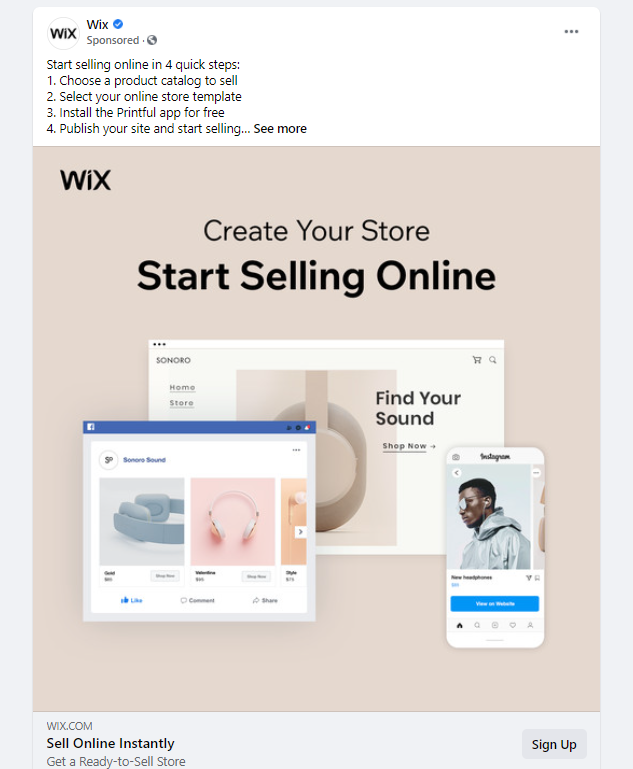
The example from Wix below is a nice case in point.
The Wix ad is clear. They’ve distilled their offer to a simple formula: “start selling online in 4 simple steps.”
The landing page builds out on that offer. It delivers on the promise of the ad. The visitor knows what will happen when they click on the button. Moreover, the landing page delivers that additional information you don’t have the time or space to provide through social media.
That additional information increases the likelihood of a conversion.
2. Optimize for mobile devices
Most people use their mobile to access social media. According to research by Broadband Search, 83% of social media usage is on mobile devices.
In other words, your social media landing page should be designed for mobile users.
The content on your landing page needs to be easy to browse on a mobile device. Use suitable font size, don’t clutter the design, and make the conversion simple—for example, an easy to press button, no tricky input fields, etc.
When creating your social media landing page, make sure to test it first on your mobile device. It’s easy to forget to do this because there’s a good chance you’ll be creating the landing page on your desktop or laptop.
3. Keep the page simple
Your landing page design needs to be simple. The more complicated the page, the lower your conversion rate is likely to be. So, keep the layout simple and only include the necessary design elements.
Firstly, you should remove all the navigation elements. You want your visitors to do just one thing.
Secondly, it’s good practice to break your landing page down into segments. Above the fold or within a short scroll, you should have the offer without embellishments.
That initial offer without embellishments is for people who are ready to take immediate action. They don’t need to be convinced as to why they should take the action you promoted. They are piping hot leads.
Below that initial offer, though, you need copy or marketing material that addresses the desires and pain points of people who aren’t immediately convinced of the need to convert.
By addressing a visitor’s desires and pain points, you’ll increase the chance of a conversion. This Zendesk landing page is a great example of an initial offer without embellishments:
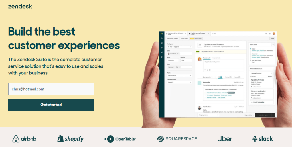
The landing page has a clean, simple layout with only the essentials. It includes a short description, a clear call to action, and high-quality visuals complement the copy. Then at the bottom, you even see social proof that can encourage visitors to “Get Started”.
Below that initial offer, there’s more content. That content is for people who need a bit of convincing before they “get started”.
4. Use consistent brand messaging
Consistency is a basic principle in branding and marketing in general. There needs to be consistency between your social media page and the landing page.
How do you ensure consistency?
Similar visuals, fonts, and colors are needed. You can even use the same copy or slightly adjust it as appropriate. Essentially, the primary messaging needs to be the same.
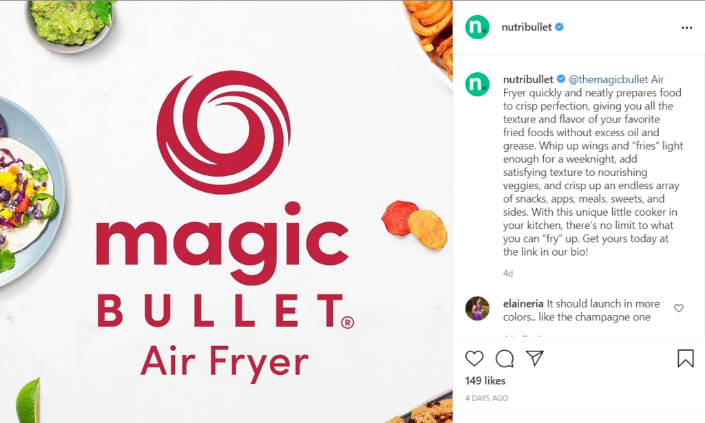
In this Nutribullet Instagram post, note the image selection, font choice, and tone of the copy.
Now compare the visuals, font choice, and copy with the landing page:
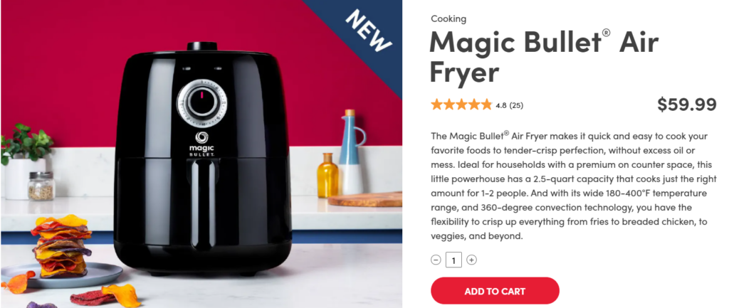
The image is of the product advertised, and the color palette is similar. When it comes to the text font, it’s also consistent with the social media post. While the landing copy lists the product’s specifications, it maintains the same conversational tone as the Instagram caption.
If you use email marketing, the email needs to be consistent with the rest of the brand as well – whether it’s the choice of images, written copy, or tone.
5. A/B test your page
The first landing page you create will hopefully be great. However, you designed the page based on intuition and insights. You can use data to optimize your page.
That’s why A/B testing is so important.
A/B testing involves creating two versions of the same page and seeing which performs best. Through optimizing the most important parts, like the call to action, you can see if changes improve your conversion rate.
Conversion rate optimization should be an ongoing process. It’s important to monitor your conversion rate as well over time. If you see a drop in conversions, it could be the time to design a new social media landing page or create a new offer.
In Closing
Social media is only going to continue growing as an e-commerce platform. That means social media landing pages will continue to be a critical element in your marketing arsenal.
This article looked at five tips you should follow to create that social media landing page that converts. Consider your offer, design for mobile, and be consistent with your brand messaging. Keep the page simple, and don’t forget to A/B test, too!
If you follow these tips, you’ll create that winning social media landing page that generates the results you’re looking for


