Abandoned carts are the shortest horror stories running in the eCommerce industry.
It is heartbreaking to see products being added to the cart just to get left behind later. However, never lose hope without giving it a few last shots via curated and customized shopping cart abandonment emails.
When a website visitor takes out time to go through the product page and add the same to the cart, the purchase intent is high. They know what they want to buy and almost left at the last stage for some reason. That’s our catch – to find the reason and provide ultra-personalized emails to woo them back to complete the purchase. Cart abandoners are at the bottom of the sales funnel and need one more push before they convert. An average documented cart abandonment rate is staggering 69.57%. The number of lost sales across verticals can go beyond our imagination if we don’t act upon it.
Just like any other email marketing campaign, abandoned cart email campaigns also consist of design and promotional aspects that can lead to conversion. Today, we are going to discuss (with real examples) about what it takes to lay out a perfect cart abandonment campaign that actually converts. Let’s get started…
The Prep
Before we move on to the best practices to craft a perfect cart abandonment email, there’s a small step you need to follow. The whole campaign runs around sending win-back or conversion emails for the abandoned products. It is a no-brainer that you need to collect the visitor’s email address. If they are your existing customers then they’ll probably login before browsing, but if they are the first time visitors, you need to set up a form to collect their emails.
It can be a side pop-up box or an exit pop-up notification, a slider, or simply an account creation form. Collecting contact information is the initial step to build an email list and nurture the leads. Not only for cart abandonment but also for future business communication – this is the base.
Now let’s start with the abandoned cart email best practices that will help you convert.
1. The Design
Now we know that email template design is at the core and you probably don’t want to learn about the structure. We put design at first because cart abandonment email designs are not like your regular promotional emails. An important aspect to consider here is the email service provider (ESP) you are using. There are free HTML email templates available at your disposal, but not all will render the same or comply with your ESP. That’s where you need platform-specific guidance. Take help from Mailchimp developers, Marketo certified associates, SFMC email specialists, and professionals who are trained and experienced for conducting campaigns that are ESP specific. Cart abandonment email templates should be crisp, clutter-free, and direct. Upsell and cross-sell is still allowed but not at the cost of abandoned product/s highlight.

This mail template by Adidas is sent via Mailchimp ESP. The noteworthy things about this abandonment email are highlighting reviews to build trust, customization options, quick shop links, and wordplay to grab the attention.
2. The Subject Line
Being a marketer, there’s no need to explain how important it is to wisely choose the words for your subject lines. But when it comes to Cart abandonment emails, you need to be extra cautious, hyper-personalized, and word-wizard. Take a look at some of the subject line examples,
- You left without saying goodbye. – Lendingtree
- You’ve looked at some great LEGO sets! – LEGO
- Cart reserved (with the best offer available) – Society6
- Quick heads up… – Beardbrand
- Your shopping bag missed you! – Dote
- The Artwork You Looked At Are Being Discovered – Saatchi Art
- Finish Your Order at Ralph Lauren – Ralph Lauren
- Everything cool with your transaction? – BONOBOS
Curiosity, confirmation, reminder, surety, and sweepstake – these all are the factors you need to incorporate before writing a subject line for cart abandonment emails. Along with a very focused body copy, the first line to grab the attention will give you email opens.
3. Drip Campaigns & Frequency
Setting up drip campaigns or email automation workflows is to set a series of emails referring to the same context. Running a series of three abandonment cart emails result in 69% more orders than a single email. To stay at the top-of-the-mind, schedule timely emails that can yield conversions. Ideal email frequency could be – 1st email within an hour, 2nd email within 24 hours, and the last one within 48 hours.
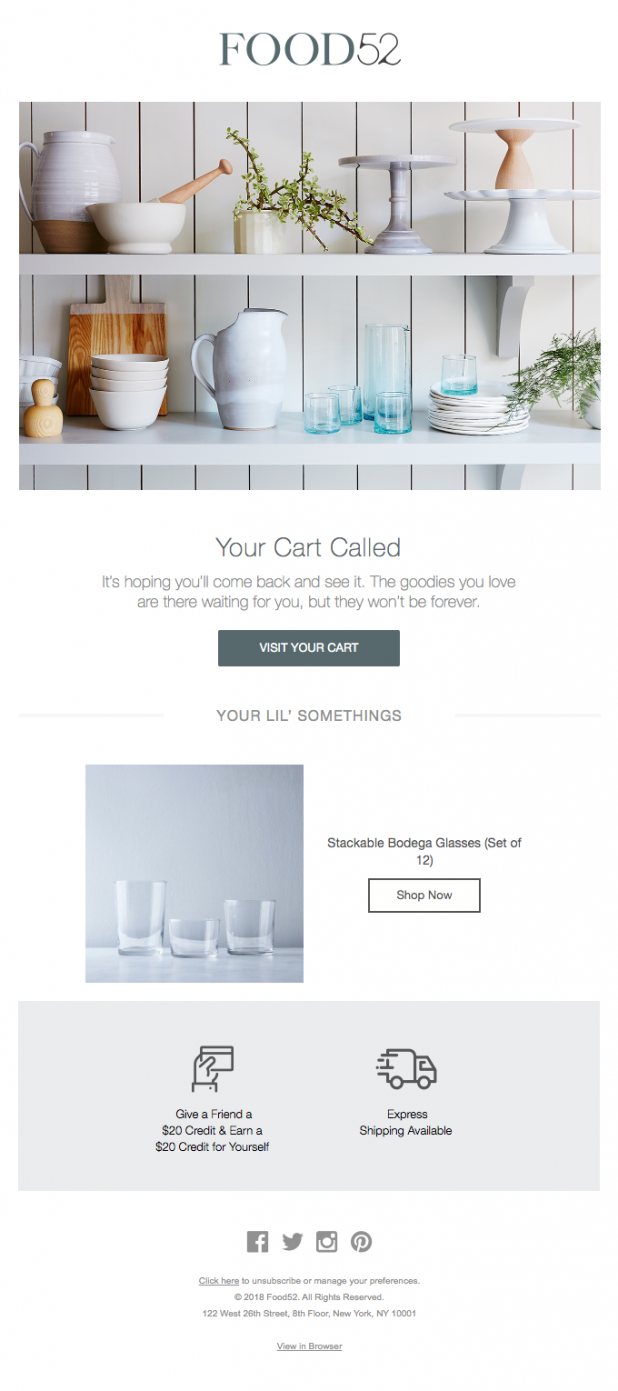
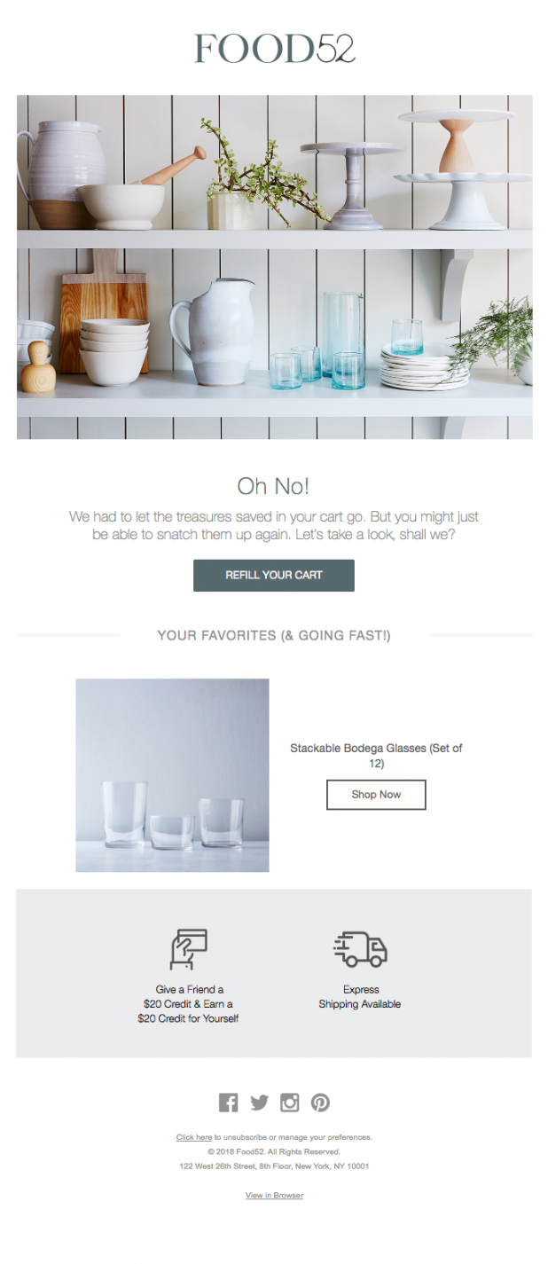
Do not make the mistake of sending these emails with the same subject and body copy. Be creative with your every approach and display the product/s to entice them. Check out the following emails by Food52.
Email (1)
Email (2)
4. Lure them with offers
Everyone loves discounts, and when it comes to smart shoppers of recent times, there might be chances that they deliberately leave the cart unattended in order to get an offer. The most common reason for cart abandonment – 55% to be specific, is due to high shipping charges. It is vital that you keep a margin while setting up prices to later entice them with a sweet discount, price-drop, or at least a free shipping arrangement. Having to pay less for what you intend to buy is probably the most enticing trigger an abandoned cart email can have. Here are a few examples.
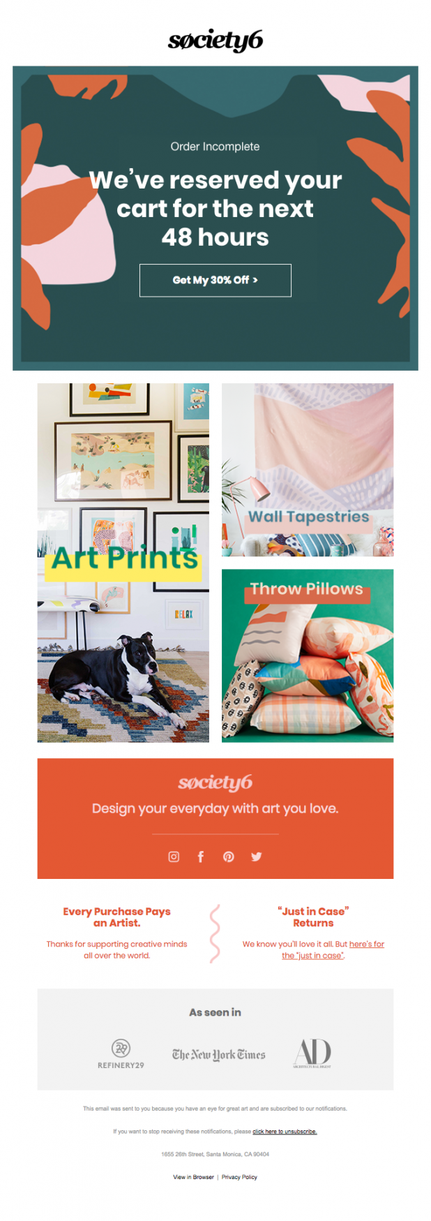

These emails by Society6 and Alex Mill depict how you can remind them about the products available in the cart with a generous discount on completing the order.
Pro Tips
- Ultra-personalization is the key when it comes to cart abandonment emails. You can utilize the features like first name tag, customized subject line, offer recommendations as per past order/s or browsing history, and more. These emails should directly talk to them and should not look like a generalized message.
- You can display features, reviews, and important details about the abandoned product/s to give a push to the buying decision making. Price display is optional but product image isn’t.
- Set up a built-in checkout page into the email itself so that they don’t have to switch browsers or webpages to make the payment.
- Make the email template interactive with elements like GIFs, Videos, and Images.
- Be creative with your Call-to-action. Period.
Take up some more inspiration from the following examples,
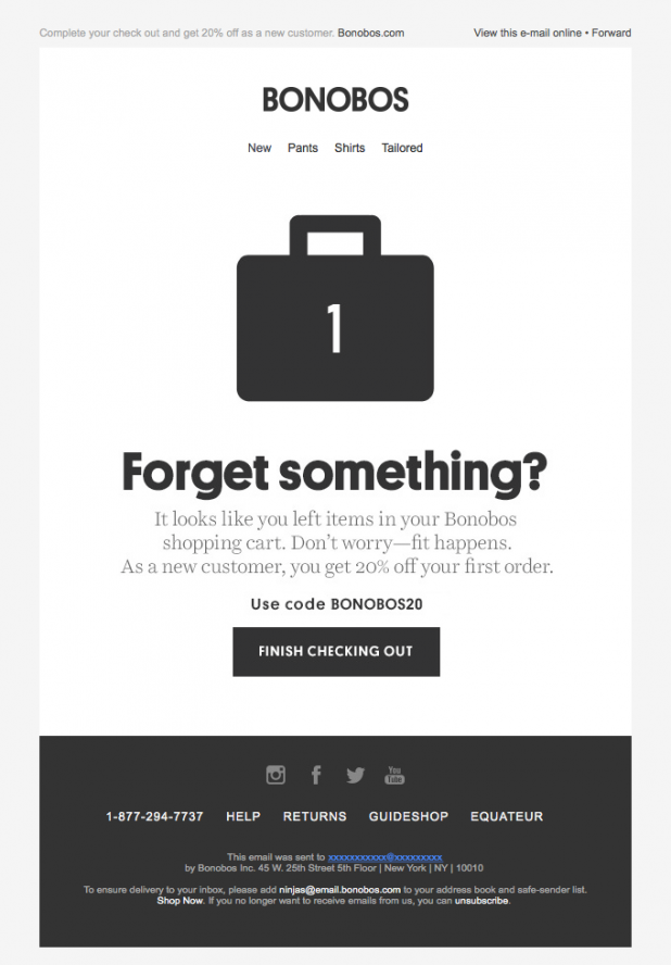
1. BONOBOS
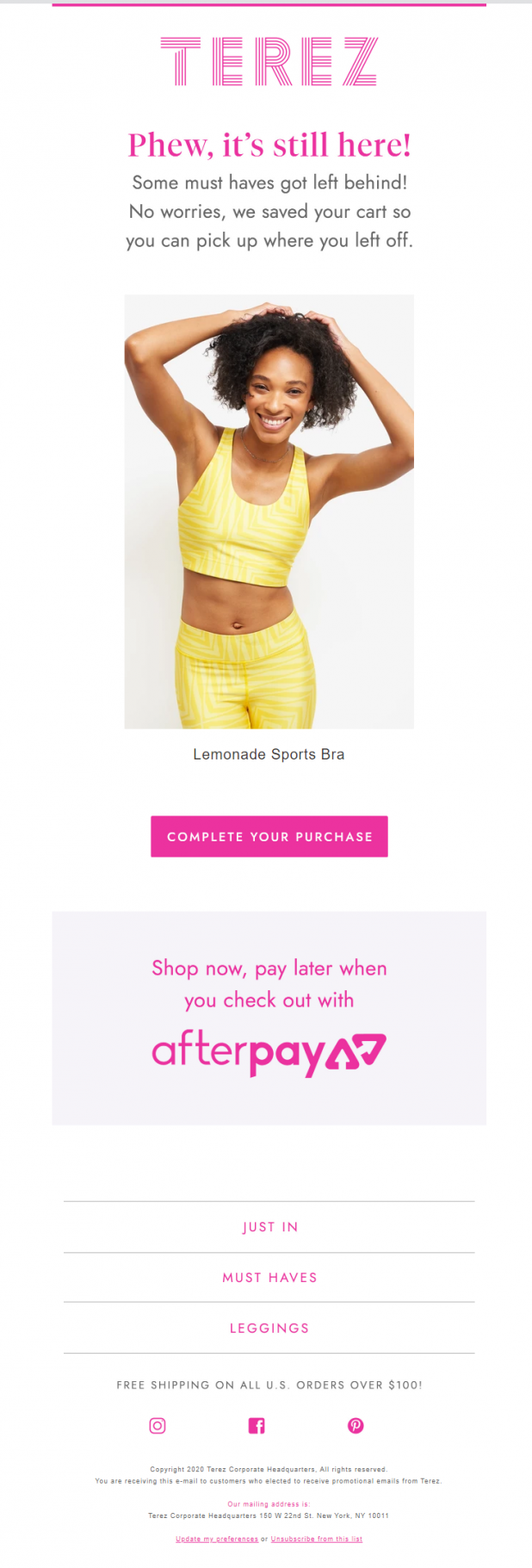
2. TEREZ
Wrap Up
Studies show that cart abandonment emails get 45% open rate, 21% click-through, and out of those who click, 50% users make a purchase. A perfect abandoned cart email would lure the prospects to order, while automation will ease the time-consumption issue. Make the most out of email marketing tools, take the help of experts where needed and bring back those almost lost sales home.


