To help website visitors remember their brands, business owners use visuals. The power of images to attract attention, resonate with new audiences, and promote products is undeniable. According to statistics, people remember 80% of the images they see and only 20% of the texts accompanying them.
However, when it comes to readability, image publishing mistakes can cost businesses their user base. In this post, we will take a look at four publishing practices that may help you make the most of website visuals. But first, let’s explore why images are important for business websites.
Why You Should Add Pictures to Your Posts?
If you want to attract and retain website visitors, adding photos to your website might be the missing piece to higher content engagement. Here are the benefits of including pictures in your blog posts and landing pages:
- They make explanations digestible. Adding icons to a list of directions or guides makes it easier for users to follow the explanation;
- They evoke the right feelings. A powerful copy can be memorable but a catchy, attention-grabbing image is, indeed, worth a thousand words. Whether you are promoting a product or introducing new users to the company’s values, make sure to show, not tell about your ideas;
- They attract the right audience. Even if depicting the same thing, two images can make the world of difference and appeal to different audiences. Take a look at these two food photos. The one to the left is sleek, designed in dark colors, and clearly speaks for a brand. It may attract mature audiences. The one to the right, however, is bright and light-hearted. It will resonate well with Gen Z and millennials.
- They create your brand identity. When it comes to people, we rely on visual characteristics (e.g. face, clothes, eye color, hair shades) as much as on personality. These subtle clues help us get to know each other better. Similarly, corporate images should be a form of your brand’s self-expression. Custom fonts, pre-defined colors, symbols, figures will help you stand out among competitors and stay in the user’s mind for longer;
- They improve search rankings. Google crawlers analyze images to determine the quality and credibility of your content. If the visuals you share are original and align well with the content, your company’s blog posts will be ranked higher. Other than that, Google Images is a powerful way to attract more visitors to the website. At the end of the day, the tool accounts for over 26% of all web searches.
4 Practices to Follow When Publishing Images Online
From image size to quality, these are the elements that determine whether a visitor warms up to your website or not.
As a website manager, you should take your time to learn what type of images your audience finds appealing. The good news is that there are universal practices to follow. And we will explore these tried-and-true image publishing tips below.
1. Get to know popular file formats
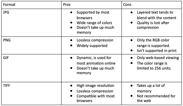
Images come in different shapes and forms. Even if you are not a graphic designer, JPEG, JPG, PNG, TIFF probably sound familiar. Understanding the features of the most common formats will help you choose the right one for publishing. Although you can nail it using a file upload widget that will automatically convert images into the most efficient format, knowing the difference between image formats will never hurt.
Here’s a short summary of the properties of top image formats, as well as their pros and cons:

Determine what is more important to you: image resolution or loading time, and choose the file type that suits your needs.
2. Edit your photos before hitting “Publish”
Even if you have a team of designers, skilled in creating high-quality graphics, the truth is, most pictures require a final touch-up before you can publish and share them with others. There’s no need for extensive, Photoshop-based editing. You will be fine as long as you follow this basic checklist:
- Crop the image so that it fits the layout of your page. Make sure that the picture doesn’t overlap important text bits or that it’s not too small;
- Adjust the exposure. The contents of the frame shouldn’t be too dark or too light;
- Add branded elements. Make it a habit to add corporate fonts and colors, as well as the company’s logo before publishing a photo online.
3. Resize images to improve performance
As much as the format and the aesthetics of the visual, website managers and designers should mind image sizes. Look at image dimensions from two angles:
- Memory space: the amount of kilobytes a file takes up. This one influences the loading time, as well as the SEO ranking of a page. Normally, website managers try to reduce the file size to meet the optimal value of about 125KB;
- Image size: an actual size of the visual on the page, measured in px. For WordPress, 1200×628 is the optimal size.
4. Add alternative text
Don’t forget about one last touch before you publish a picture online — optimizing it for SEO. This means adding a caption to every visual and of course, adding alt-tags. This way, if a user can’t load a picture, an alt-tag will help describe what was in the frame. Search crawlers check for those elements as well, so be sure to add them.
Conclusion
Adding images to blog posts and menu pages is a powerful tool that’ll help your website rank higher, attract users, and bring in more revenue. However, if these visuals are optimized poorly, they will do more harm than good, tanking the website’s ranking and user experience.
To ensure that you make the most out of publishing photos online, edit them before publishing, get the hang of file types, add alt-tags and captions, and don’t forget to adjust file sizes. If you follow these simple tips, publishing pictures will benefit your online presence.


