The Covid-19 pandemic has caused companies around the world to rethink their advertising campaigns. Before the coronavirus, the advertising market was forecast to grow to $865 billion by 2024.
However, since the pandemic has forced entire nations to quarantine at various levels, the ad industry has had to adapt very quickly. According to the Interactive Advertising Bureau, 70% of media buyers have adjusted or paused their ad spend until Q2, while 74% believe that the pandemic will have a bigger impact on advertising than the 2008 global financial crisis.
Beyond merely changing the amount of money they spend on their ads, media buyers are also changing the message of their advertising. In comparison to focusing on products or direct sales, companies are pivoting their ads to mission-based marketing (an increase of 42%) and cause-related marketing (an increase of 41%).
Given the current climate, this makes a lot of sense. While Covid-19 is mainly a health crisis, it is also an economic crisis, and companies have to find a natural balance between still advertising their brand without focusing on sales, or emphasizing pain points to their audience. Showing the same types of sales messaging during a crisis can come off as tone deaf, similar to Kim Kardashian’s birthday fiasco.
Given the pivot, the predictive eye tracking company Attention Insight looked into how Covid-19 ads, with a focus on mission-based or cause-related marketing, have been received by the audience by determining which part of the ads caught people’s attention the most.
“Even during the pandemic, people look for support and reassurance from the brands they trust,” says Kamilė Jokubaitė, CEO and Co-Founder at Attention Insight. “Thus, crafting good ads that are positively perceived by consumers can increase brand loyalty or even a market share.”
With these analyses, we can see what types of elements of ads are effective at delivering a company’s message, and what type of elements disbalance the ad and create confusion or pollute the message.
Attention Insight, which uses deep learning, does this by taking an image of the ad and assuming it takes 100% of the audience’s attention. Then, it uses its predictive eye tracking algorithm to mimic the human vision for the first four seconds after seeing an ad for the first time. It then gives percentage points for the selected elements of the ads that people would find most noticeable.
With these results, advertisers can gain some valuable insights into how they can increase the effectiveness of their Covid-related ads to maintain or improve their brand awareness during these challenging times.
Insight #1: faces win – except when they aren’t interesting
Multiple studies have shown that using faces within advertising can help ad creators elicit empathy within the viewer. Based on the emotion of the face, the advertiser can get a better response.
On a common sense level, it is natural that advertisements containing faces – usually human faces – would catch our attention more than a particular product or scenes of a landscape of some sort.
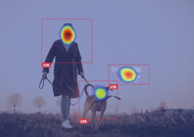
Based on analysis from Attention Insight, these generally accepted rules of thumb seem to hold. In this advertisement from Happy Tails, we can see that most of the Attention percentage points are taken up by the woman’s face, followed by the dog’s. After that, the attention goes towards the lone text on the image, suggesting viewers to adopt a pet.

“Many eye tracking studies and our practice proved that faces draw and hold people’s attention,” says Kamilė Jokubaitė. “Eye gaze is also worth mentioning. If possible, aim to place your headline in the line of sight to improve its percentage of attention even more.”
There are some other aspects of this ad that are worth highlighting; however, let’s address that after addressing the caveat to the face rule of thumb: the face in the ad has to be noticeable or easily visible in one way or another.
Take for instance another ad analyzed by Attention Insight (for the best experience, view the ad on their page).
In this Covid-19 awareness campaign by El Sr Franco, a warrior is seen wearing the ubiquitous protective mask visible everywhere nowadays. However, based on Attention Insight’s algorithm, only 4% of the user’s attention is focused on the face, and most of it falls on the text.
One of the most likely reasons for that is that there is very little visible difference in the colors of the face and the rest of the ad. All elements of the face are pale in color and have low contrast, so that nothing on the face really stands out from the rest of the ad. Even worse, the eyes are mostly hidden, and the human gaze in advertising is normally considered a crucial aspect for engagement and favorability.
One important aspect from the Happy Tails ad worth mentioning then, is the relative simplicity and emptiness of the background, so that the viewer’s attention has little else to focus on but the two faces and the lone text.
Insight #2: Keep it simple – but focus on the message
Building on that message – about clearing up space to highlight what’s supposed to be the focus of the ad – analysis of other ads by Attention Insight showed that the ads that had the least amount of elements had good success in having attention placed on critical aspects of the ad.
This goes along with the Navy-created KISS principle – which stands for ‘Keep it simple, stupid’ – which states that designs should be as simple as possible. This has been adopted en masse by engineering and software engineering circles, but also is a mantra in the design field in general.
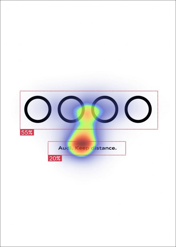
One Covid-19 related ad analyzed by Attention Insight from Audi gives further credence to the KISS principle. In the ad below, you can see the Audi logo modified for Covid-19 – all the circles, usually interlinked, are separated – and the message is clearly about social distancing.

Based on the way that Attention Insight’s predictive eye tracking algorithm analyzed this ad, people would naturally see the logo first, guess its purpose, then go to the text for confirmation of the message. The ad is only black and white, with one modified logo and three words, and it gets the message across very effectively.
However, simplicity has to be well-crafted. In another minimalist ad analyzed by Attention Insight, the message being communicated is less effective. In an ad for the Greek healthcare Iaso Group, an image of the ubiquitous Covid-19 medical gloves is shown, giving off a peace sign. It’s similar to the Audi ad in that it’s an image and some text with nothing else in the background.
However, the proportions are off, and the predictive eye tracking algorithm reflects that. The picture takes up most of the space, but when people’s gaze moves to the text for confirmation of the assumed message they received from the image, they come up to a problem: the text is too small, too faint, and too far away from the image. The image gets 88% of the attention, but the explanation/confirmation text only gets 6%. The group’s logo gets 2%.
When a user looks quickly at this ad – and people usually view static ads for 1-2 seconds – they’ll come away being either confused or having unconfirmed assumptions, which isn’t good for effective communication either way.
Attention Insight CEO Kamilė Jokubaitė advises ad creators to consider the balance of the elements in their ads: “When marketers try to create a well-performing ad, they should keep in mind that different elements have to grab the user’s attention and fit well together in order to deliver the continuous message that users can comprehend.”
Bottom line
Taken holistically, in terms of the global context of these ads (the pandemic) and the ads themselves (the intended message), there are a few major takeaways we can list here.
In global terms, the messaging on your ads should probably be focused more on a movement away from explicit product sales (for example, “coronavirus fire sales”), towards more of a brand-building phase to communicate empathy for the viewers’ likely difficult situations.
When it comes to ad creation, the analysis that Attention Insight did in terms of viewers’ attention shows that the bedrocks of retention, design and favorability still remain if done well:
- focus on people’s faces, but make those faces special, emphasized, or contrasted in some way
- keep it simple, but make sure the remaining elements on the ad are well positioned to effectively communicate the message
Beyond that, it’s important to always keep testing different ways to get the message across most effectively.


