Have you ever visited a brand’s website only to be appalled by its web design?
If so, you are not alone. According to WebFx, 94 percent of people form first impressions about a brand solely based on its web design. And 75 percent of the credibility of a site comes from its design.
For businesses, this signifies a critical insight – unless your web design is up to mark, you won’t be able to attract customers. After all, 38 percent of people stop browsing a site if they find it unattractive, and 57 percent of people won’t recommend a given business to their peers if it has a bad website.
With such alarming statistics, businesses need to work on creating an efficient and visually appealing website. Here are design elements that can help attract customers.
1. Brand it consistently
Your website is just one of the mediums your brand is present on. However, you should not design it in isolation. Instead, branding efforts must be relayed to every medium your business has a presence on.
Why?
Well, for starters, as per Forbes, consistent branding can help improve revenue by 33 percent. Additionally, it also helps in improving your brand recognition and recall.
How does branding translate to your web design?
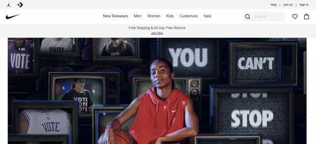
Firstly, you must pick a color scheme that goes with the theme of your business. Nike is an excellent example of this. Just like its logo, its website features two primary colors – black and white.

This brings us to our second point – logos. Make sure the logo of your business is placed properly on your website throughout it. While you are at it, ensure that your logo is simple, memorable, and effective. Solutions like those provided by the Logo Design Valley can come in handy here.
2. Don’t rely on text; use infographics instead
One cannot understate the importance of quality content. For optimization, website content is imperative.
However, you must balance text with visuals. This is because the human brain processes images faster than it processes a piece of text. In fact, 60,000 times faster! It would be a shame not to leverage this insight to create a more likely design to attract customers.
But, the question remains – how can you relay information about your brand while using pictures? The answer is infographics! Infographics present information in a pithy and visually appealing way.
You can use them to illustrate your company’s history in a creative manner as well as sharing information about your products.
3. Make it responsive
According to Statista, over 50 percent of the total internet traffic comes from mobile phones and tablets. Unless working, most people prefer using their smartphones for browsing the internet rather than the PC.
This means that unless your web design is responsive, you will lose out big time.
Make sure that your website is easy to use and aesthetically pleasing on different screen sizes. Also, what may work on the desktop version may not work on a mobile screen—research how users navigate websites on mobile phones and design your website accordingly.
There are two things that you will need to include – fluid grids and flexible visuals in technical terms.
4. Don’t forget functionality
In the quest to create a visually appealing website, don’t forget the importance of making it functional.
While an aesthetically pleasing design ensures that a visitor does not abandon the site instantly, the user interface governs whether or not the visitor will convert into a customer. Hence, create a roadmap when designing your website. Make navigation of the website as easy and as simple as possible.
The categorization of items, along with brief information, helps customers in getting the information they need without specifically searching for it.
Similarly, in case your website functions as an Ecommerce platform, keep the checkout process as simple as possible. Always showcase the cart, regardless of the page the customer is in. And keep the checkout short to prevent frustration from building up.
5. Illustrate your credibility
One trend that is likely to shape online experiences in this era is just how skeptical the modern consumer is. Gone are the days when people are swayed by promises made by brands. Now, we look for peer reviews and evidence of quality.
Your website can be an excellent way to showcase your legitimacy. Are there any certifications your business has gotten? Add its logo prominently. Has your business been rated by credible websites and platforms? Mention it in your content.
If possible, share your portfolio and focus on how your brand was able to help a given client.

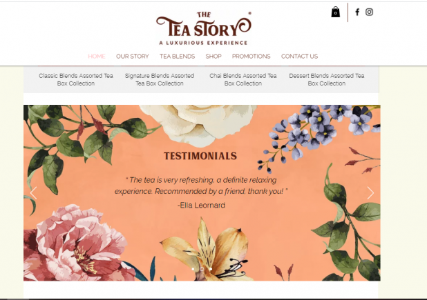
Additionally, add testimonials of your clients. But do so in a creative way. Tea Story includes customer testimonials as part of its homepage. However, it does so via using direct quotes of customers and presents it in a flowery pattern, which is consistent with its overall web design.
Ending Remarks
Attracting visitors to your website is the first step for converting them into visitors. Don’t take this step lightly. The design elements you incorporate in your site will determine just how well your brand fares in your consumers’ minds.
To sum it up:
- Use a consistent color scheme and place your logo strategically on your website
- Use visual elements wherever possible to boost readability
- Make your website mobile-friendly
- Ensure your site’s functionality and ease of use
Reflect your credibility via portfolios and testimonials.
With these five steps, you are likely to create a web design that users don’t abandon. With your online presence taken care of, you can focus on delivering quality products and services.
Good luck!


