Being able-bodied is a temporary condition.
Some of us are born with disabilities, and some of us develop them. At some point in your life, you will get old enough to need reading glasses, or you will break your arm, or you will develop hearing problems. Are you reading this page through glasses? Are you using a wrist brace or ergonomic mouse? Is your operating system set to dark mode? Those are all accessibility modifications.
The web was born accessible
One of the things I love and appreciate about the world wide web’s governing body, W3C, is that they are constantly working to make and keep the web open and accessible. The standards that browsers and other software use are derived from the W3C recommendations. Your current browser can serve pages from 1998 and they are perfectly legible, and even pretty, if the images were captured.
The W3C has a group dedicated to accessibility, and their new set of standards, WCAG 2.2, will take effect November 2020. In December, a website’s accessibility will be rated based on the new standards.
> WCAG 2.0 and WCAG 2.1 are stable, referenceable technical standards. They have 12-13 guidelines that are organized under 4 principles: perceivable, operable, understandable, and robust. For each guideline, there are testable success criteria, which are at three levels: A, AA, and AAA.
There are lots of easy accessibility fixes for web pages, such as using semantic headings instead of text styling, and using HTML buttons instead of DIVs, and many times, even the lowest level, A, is missing from an organization’s web pages. But like everything in software, progressive improvement and rapid feedback are more useful than a large transformation project that requires a massive commitment.
Some web accessibility needs conflict
Sometimes, accessibility needs conflict. For example, in the example users in the WCAG documentation, some of the users need their text to reflow around increased-size buttons, and some users need the buttons to stay in a stable location for findability. If you’ve ever been frustrated when a phone update reorganizes all your apps, you can identify with how difficult it can be when an everyday interface changes without permission.
Low-vision users are often helped by high-contrast text, black-on-white or white-on-black. However, users with dyslexia and other text-processing disabilities can find the contrast too jarring and need a lower contrast to help them read comfortably–something like dark grey on off-white. It’s difficult for a site or application to meet those conflicting needs, so users often have browser extensions or settings that help them manage their web experience.
Site and application developers need to be aware that not everyone is using their site or app exactly the way the developer sees it. Users may have smaller screens, or be on a mobile device, or have installed browser extensions the developer has never heard of or imagined. This system works as long as we develop according to the accessibility standards that keep the web semantic. It seems contradictory that making the web accessible to machines helps humans, but it does, because the humans are using the computer’s concepts to translate information in a way that works for them.
How feature flags can help
I’ve been thinking about how feature flags could make designing for accessibility easier, especially around the problem of trying to serve populations with different needs.
When it is possible to serve everyone that should be the default and the main page code. Everyone is served by standards like semantic headings, image alt text, and text that is not an image. Some people need further accommodations, such as reduced motion, tab navigation, or large buttons. Those needs could be flag variants.
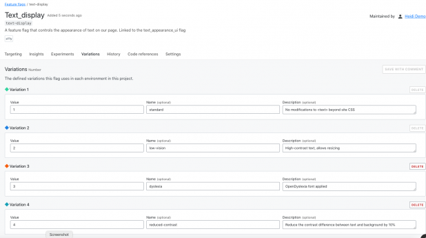
In the image below, I have configured a flag with four variations for text display:
- Standard (no changes to CSS behavior)
- Low-vision (high contrast text, allow resizing)
- Dyslexia (use OpenDyslexia font in CSS)
- Reduced contrast (Reduce the contrast between text and background)
This flag variation could be tied to a user-configurable setting, so that every time they logged into the site, they would get the text the way they need it, even if they were on a different browser or device.
That’s a simple example, of course. Ideally, developers and accessibility advocates would work together to determine which part of the site or app should be modified, and how it would work in combination with other modifications.
Lack of planning is technical debt
Even if your team doesn’t have user research or accessibility experts available all the time, you can code proactively to make room for them. Accessibility flags would be permanent–you wouldn’t want to remove them as you would a rollout flag. Since they are permanent, there is no harm in using them as a placeholder, they won’t add more testing demand empty than they will full.
At the start of a project, most teams don’t have the resources to do everything they want, even though they know it will need to be done eventually. We don’t do localization for proof-of-concept applications, we don’t write API documentation for strictly internal tools. But if a product succeeds, then we do need to add those elements and they become technical debt that we have to pay off without adding new value to the product.
One of the ways to reduce the cost of this debt is to add placeholders for future modifications. Trying to refactor an application with hard-coded interface elements to accept localization is like trying to add chocolate chips to cookies that are already baked–it’s much less effective. Using flags set to only return a default value (for now) is a way to plan for future changes in your code, without making the full investment.
The future is here
The WCAG standards are not arbitrary or imposed without meaning. They exist to help everyone access the information, services, and capacity they need. When we build sites that don’t meet those standards, we are losing customers, clients, and users–and not in small numbers.
Using feature flags to make your site accessible is a smaller, cheaper intervention than creating entirely separate sites. Feature flags also help build the framework to provide other elements of your site on an on-demand basis, allowing you to meet user needs with precision and efficiency.


