Have you heard of Blue Apron?
They sell fresh ingredients that you can use to cook your favorite meals.
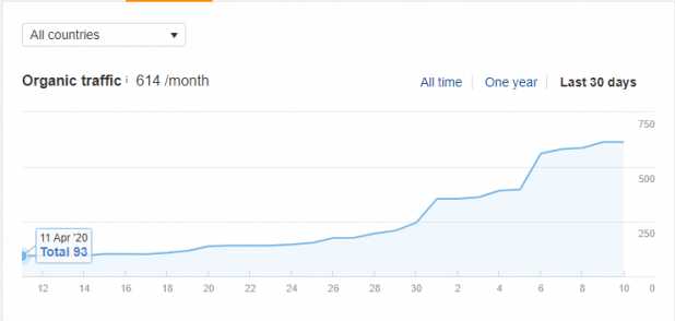
The image above shows the increase in organic traffic of one of their top ecommerce landing pages.
As you can see, their organic traffic volume grew from 93 visitors per month to a whopping 614 over a 30-day period.
That’s over 560% growth right there!
Any ecommerce store owner would kill for such explosive growth in traffic because a higher volume of traffic translates to more sales.
Now, here is a disclaimer for you.
Acquiring such a high-volume of organic traffic is not easy.
It is a huge challenge that every ecommerce business has faced during its growth period.
A ton of planning, testing and coordinated activities have to be performed in the backend of your landing page to produce such impressive results.
But what are those well-planned activities? What makes a landing page outstanding? What should one think about before designing an ecommerce landing page?
That is what I am going to cover in this discussion.
Stay with me.
I would like to start with –
What is an ecommerce landing page?
An ecommerce landing page is a web page that has been designed to sell a product. The product can be anything from a cool smartwatch or an eBook to a tractor. It can be a service as well. People land on this page when they click on a link they have come across online.
With the definition covered, I would next like to discuss –
What questions should you ask before designing your ecommerce landing page?
Nothing excellent is made with random thoughts. Ecommerce landing pages are no exception to that rule.
So, what bases should you cover before you start designing your landing page?
Here are the questions you should be asking:
1. Who is your target audience?
This question is the first and foremost that you need to ask yourself. Your product or service is not for every John or Jane on mother earth. Only a particular group of people will be interested in your offer.
Before you start designing your ecommerce landing page, prepare your buyer persona. A buyer persona is a semi-fictional profile of your desired customers.
When you know exactly who your customers are, you have won half the battle. You will be in a position to optimize your entire marketing campaign for those particular people.
2. Once people land on your landing page, what do you want them to do?
This is another crucial point for you to cover. You would, of course, want the landing page visitors to take a specific action. It could be buying something, signing up for a newsletter or service, etc.
If you have a crystal clear idea about that action, you can optimize every element of your page around that. Every image, video, keyword, customer review you inject into your page will nudge your visitor to take that action.
3. Where are your target customers coming to your landing page from?
Are your target customers coming from a social media ad? Or are they are landing on your page from a Google search?
Since people tend to favor seamlessness, asking yourself this question is extremely important.
While I suggest a landing page for every campaign, it may not be possible for all ecommerce business owners. Nonetheless, do cover this question before you start working on your ecommerce landing page.
4. What keywords should you inject in your ecommerce landing page?
Keywords are those words or phrases people use to look for something on a platform (search engines, social media, online market places).
Your page site copy must include the relevant keywords for high conversion.
These keywords, if properly used, will help engage your visitors with your ecommerce brand.
Before working on your landing page, I strongly recommend that you perform in-depth keyword research.
This comes in handy not just for your ecommerce landing page but any future ad campaigns you decide to run.
At this point, you should have a decent idea about the questions you must ask yourself before crafting your landing page.
Criteria of an ecommerce landing page that can get you sales
An ecommerce landing page capable of selling a product has several criteria.
However, the scope of this discussion does not allow me to discuss all of them.
Thus I will be talking about just four:
1. Fast-loading
A high-performing ecommerce landing page must load in under three seconds and even faster when it comes to mobile devices. Studies have shown that people tend to be more impatient when using mobile devices to browse the web.
2. Conversion-optimized
Your ecommerce landing page has to be optimized for conversion. What do I mean by that?
Well, it must have all the page elements such as images, videos, buttons and keywords in all the right places. When correctly done, these elements make your page visitors feel emotions that guide them to make a purchase.
3. Seamless
When it comes to your ecommerce landing pages, seamlessness is mandatory. There is no way you can relegate it to your list of “optional” criteria. What is seamlessness? It means that your landing page must be able to rearrange its elements according to the screen size it is being viewed on and yet deliver the same experience across all of them (desktop, smartphone, tablet etc.)
4. Shareable
On the web, people tend to share anything (article, video, image, link) that they find useful. The same is true for ecommerce landing pages as well. If the product or service you are offering on your page is useful, people will want to share it. That means you must include social share buttons in easy-to-notice areas of your page.
Tips for designing high-conversion ecommerce landing pages
There are a vast number of tips you can resort to for getting more sales through your ecommerce landing pages. And those vary from industry to industry. The strategy used for selling motor-powered scooters may not work for jackets.
However, there are some tips that any ecommerce business owner can benefit from.
1. Use original/custom imagery
When designing an ecommerce landing page, you can always use stock images. And it won’t (in most cases) cause any significant drop in sales.
However, because people spend a considerable time on the internet, they can easily recognize stock images which detracts from them receiving a personalized experience. That lack of personalization prevents them from having a rich browsing experience and makes them feel less important.
So, if you want the sales from your landing page to ramp up, use custom images taken explicitly for a specific section of your landing page.
2. Insert keywords in optimum places
Remember the keywords we talked about before? Well, the keywords that you have uncovered through research can come in handy for your landing pages.
I have discussed the importance of personalized experience before. Keywords, when effectively used, can make your visitors feel just the right emotions for conversion.
So, what are the best places for keywords? Well, the most obvious ones are headlines, sub-headlines, the first sentence of every text body, CTA button etc. But I would suggest that you do not limit yourself to these places only. Use variants of your keywords appropriately in a relevant manner.
3. Craft headlines that your visitors can instantly relate to
At least 8 of every 10 of visitors will read the headline of your ecommerce landing page. Of those 8 people, only 2 will read the rest. This information should be enough to tell you how important your headlines are.
Headlines quickly tell your visitors what your landing page is about. This helps them decide if they should spend their valuable time on your page or just bounce off to YouTube.
Many prominent copywriters spend half their time on crafting landing page headline copy. So should you!
4. Humanize the benefits
Chris Waller, a successful ecommerce maestro, once said, “features tell but benefits sell”. This is true, no matter what niche your commerce business is in. But how can you humanize the benefits of your product or service?
Well, let’s say you are selling robot cleaners. One of the features is – “Can understand its environment”.
When humanized, it might say something like this, “can sense its way around your house. Thus, there is no chance of it denting your furniture or hurting your children.”
Which one do you find more appealing?
5. Optimize CTA buttons
CTA buttons are the medium through which your visitors can take your desired action on your landing page.
That means the button copy must be extremely engaging.

Have a look at Netflix’s CTA button copy. It is simple and tells you the benefit (free for one month).
Placement of the button is also of paramount importance. I recommend that you place it where it is easily visible and use high-contrasting colors against the background.
Include social proof that highlight the problem your product/service has solved
Social proof is what your visitors look for when browsing through your ecommerce landing page. They want to know if your product or service works for real people.
There is no way around this crucial element. Here is what you need to remember when placing social proof on your landing page. Make sure that you highlight the problem people were experiencing, and, of course, how your product or service solved it. Social proof presentation helps ease the minds of your visitors.
Getting sales from your ecommerce landing page is not easy
I know I have said it before, but I would like to emphasize it again. My purpose is not to discourage you. It’s the exact opposite. When designing your ecommerce landing page, you definitely want to get more sales.
For that to happen, you need to spend considerable time and energy to know what your target customers want and how you can “wow” them.
There is one thing you need to know before you leave.
There are many other tips for designing high-performing landing pages so do not limit yourself to the six I have discussed above.
If you put in the effort before taking your landing page live, your chances of raking in increased sales like Blue Apron will shoot upwards. Know that. Believe that.


